
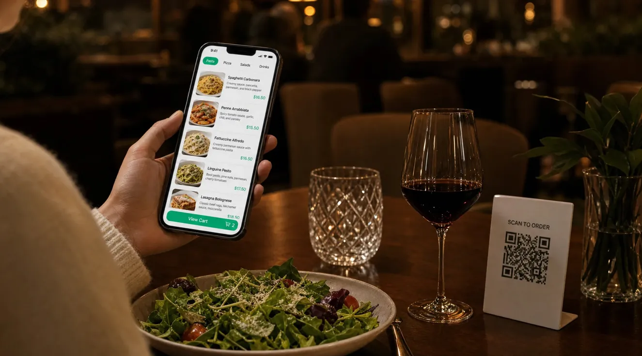
A digital menu can save you from reprinting every time a dish or price changes, but convenience depends on the guest experience. In a 2024 survey by the nonprofit National Restaurant Association, 52% of customers said they were comfortable ordering by QR code at a limited-service restaurant, while 48% said the same at a table-service restaurant. Those figures make one point clear: you can offer the option without assuming every guest wants to use it. A useful menu helps people choose food quickly, understand what they will pay, and get help when they need it.
Start With the Questions Guests Ask Before They Order
A menu often reflects the way a kitchen stores its records rather than the way a guest chooses lunch. A long list of dish names gives a first-time visitor little help with portion size, ingredients, or preparation. A person looking for a quick vegetarian meal may have to open several categories and ask a server about every promising item. If you move that same list to a phone without changing its structure, you move the confusion to a smaller screen.
You can begin by writing down the questions staff hear most often. Group dishes under plain categories such as lunch plates, sides, and drinks. Give each item a clear name, price, short description, and any choice that changes the price. For example, a rice bowl could show its base price, protein options, and the cost of each extra topping in one place. This structure helps guests compare options before they order and reduces repeated questions for staff.
The menu should also match the service you provide. A cafe may need a clear takeaway section, while a sit-down restaurant may need course descriptions and a way to identify table specials. When the categories match the visit, guests spend less time searching and more time deciding.
Give Guests a Positive First Experience on Their Phones
A guest often scans a code while standing near a counter or sitting at a crowded table. The phone may have a small screen, a weak connection, or low battery. A menu that starts with a large file download or forces a visitor through account creation can make a simple meal feel like a technical task. The first screen should answer a basic question: where are the food and drink choices?
A QR Code Menu can present current dishes and prices on a mobile page that guests reach from a table card or counter sign. You can make that page more useful by putting your main categories at the top and placing the most common order path within a few taps. For example, a guest at a bakery should reach pastries, coffee, and takeaway choices without scrolling through an entire dinner menu. A clear starting point works because it removes steps between scanning and choosing.
Test the full path with your own phone away from the restaurant’s Wi-Fi. Scan the printed code, open two categories, check a price, and return to the home view. Then repeat the test on an older phone if one is available. These checks reveal slow pages, tiny text, and hard-to-find buttons before a guest has to report them.
Keep Prices and Availability Accurate During Service
An outdated digital menu creates a different problem from an outdated paper menu: guests expect the online version to reflect what is available now. If the page lists a sold-out soup or a lunch price after lunch ends, staff must explain the difference at the table. That correction can feel like a surprise charge or a broken promise, even when the mistake was accidental. Frequent changes make this risk greater for kitchens with daily specials or ingredients that run out early.
You can assign one person per shift to review prices, availability, and service times. A short check before opening might cover today’s special, sold-out items, add-on prices, and any temporary kitchen change. When an ingredient runs out, that person can hide the item or mark it unavailable as soon as the team confirms the change. One clear owner reduces the chance that several employees assume someone else made the update.
You can also keep a simple change log with the item, new price or status, time, and staff initials. The log makes it easier to correct a mismatch between the menu and the order system. Accurate information protects guest trust because a price on a phone should match the price charged.
Make the Menu Readable and Offer Another Way to Order
A QR code can be hard to use if a guest cannot hold a phone steady, read small type, or connect to the internet. Someone with low vision may need larger text, while another guest may simply prefer to speak with a server. A dim dining room and a glossy table card can also make a perfectly good code difficult to scan. Treating the code as the only route to the menu turns an optional convenience into a barrier.
You can print a short description beside the code, place it on a high-contrast background, and add a readable address that guests can type if scanning fails. Keep a printed menu or a staff-assisted option available without making anyone explain why they need it. On the mobile page, use real text that can grow when a guest changes the phone’s text size. Headings and buttons should have clear names so a screen reader can identify them.
These steps address more than a single accessibility need. The nonprofit World Wide Web Consortium’s guidance calls for readable contrast and text that can be resized without losing content. A menu that follows those principles is also easier to use in glare, low light, and noisy service periods.
Explain Ingredients and Allergens Without Guesswork
A short dish name may sound clear to the kitchen but leave an important gap for a guest with a food allergy. For example, a sauce might contain nuts or dairy even when the dish title mentions only vegetables and rice. A translated name can introduce another gap if it does not describe the same ingredients as the original. Guests need enough detail to decide what to ask, while staff need a process for checking answers rather than relying on memory.
You can keep one approved ingredient record for each dish and update the mobile description from that record. List known allergens clearly, explain any optional substitutions, and ask a trained staff member to verify uncertain cases with the kitchen. If shared equipment creates a cross-contact risk, describe that risk plainly instead of promising a dish is safe for everyone. Clear limits are more trustworthy than broad claims.
If your menu has more than one language, review common dishes and allergy terms with a fluent person before publication. A quick translation may change the meaning of an ingredient or preparation method. A review helps guests understand the dish and gives staff a consistent reference when questions arise.
Match Ordering Features to the Way Your Team Serves Food
More menu features do not always make ordering easier. A guest may think tapping an item sends an order, while the restaurant only expects them to show a selection to a server. At a counter, an order may need a pickup number. At a table, the kitchen may need a table number and a clear record of changes to the dish. If the mobile page suggests the wrong process, guests wait for food that nobody has started preparing.
You can choose one service path and state it next to the relevant action. A display-only menu could say that guests order with staff. A counter-order menu could explain when the guest receives a number and where pickup happens. If table orders are available, you can test whether each order reaches the correct table and whether staff can see special requests. A short instruction at the decision point works better than a long explanation hidden at the bottom of the page.
Run a practice order before a busy service period. Have one employee act as a guest, another receive the order, and a third confirm the handoff. This test catches missing table numbers, unclear confirmation screens, and duplicate orders while they are still easy to fix.
Use Menu Data to Find Friction, Not Just Popular Dishes
A dashboard may show that many guests viewed a dish, but views alone do not show whether people understood the offer. A popular item could attract attention because its photo looks good, while few people order it because the price or options are unclear. The opposite can also happen: a profitable lunch dish may receive few views because it sits far below several long categories. A measure only helps when you connect it to an observable guest problem.
You can track a small set of measures, such as menu opens, item views, completed orders, and common staff questions. Compare these figures by time of day or service style, then change one thing at a time. For example, if guests often open the lunch menu but still ask about portion size, add a clear serving description and watch whether the question becomes less common. This test gives you a practical signal without treating every click as a sale.
Keep the measurement process transparent. Collect only information your operation needs, tell guests when an action will submit an order, and avoid using menu access as a reason to demand personal details. The person reading your menu matters more than a neat chart.
Check the Whole Experience Every Week
A menu may work well on launch day and fail later because a code is damaged, a schedule changes, or a menu edit leaves a broken category. A staff member may still see the correct page on the restaurant’s Wi-Fi while a guest gets an error on mobile data. Small faults can remain hidden when the team checks only the editing screen instead of the printed code that guests actually scan.
You can set a weekly five-minute test for every type of code in use. Scan a table card and a takeaway card, check an item and its price, open the page on mobile data, and confirm that the fallback menu is available. Record the date and the issue, then give any fix to a named person. This routine works because it tests the guest’s path rather than assuming a saved menu is a working menu.
The best digital menu does not need to replace conversation. It should give your guests clear, current choices and leave staff free to answer the questions that need a person. When you review the menu through a guest’s eyes, each change has a clear purpose: a simpler decision, a more accurate order, or an easier way to ask for help.